


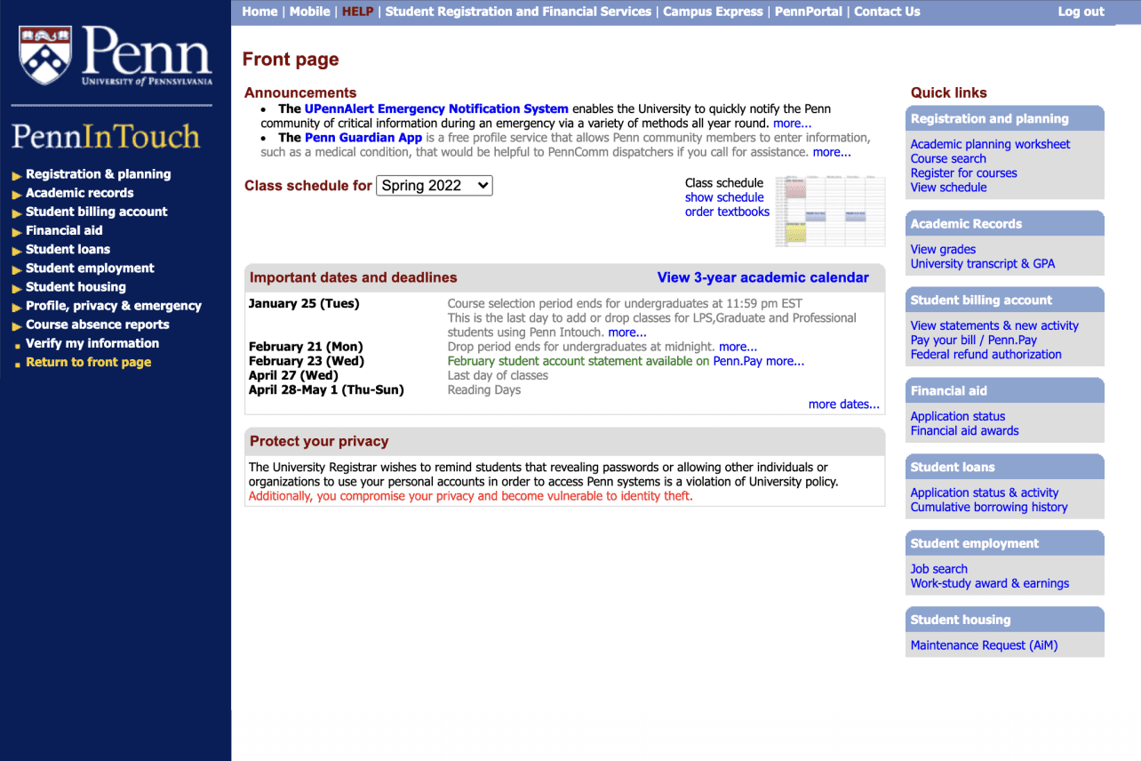
“Nothing is in touch” in Penn InTouch.
I was excited to enroll in my first classes using Penn InTouch (PIT), the University of Pennsylvania's official registration system. However, that excitement turned to frustration as I spent nearly an hour searching for information and almost missed my registration period. As a newcomer, I struggled to find what I needed - it made me wonder, why is the system so difficult to navigate?
Timeline
Jan 2022 - Mar 2022
Role
Product designer, researcher
Tools
Figma, Notion, Adobe Suite
Type
Acedemic Project
OVERVIEW
Average registration time reduced from 15 min to 5 min with 84% user satisfaction rate.

Redesigned registration process
RESEARCH
126 Survey responses, 15 interviews, 5 live sessions.
To better understand issues with the PIT system, I conducted a university-wide survey receiving 126 responses. I also interviewed 15 users including freshmen, seniors, and graduate students. 5 users performed live usage sessions of Penn InTouch which I observed and recorded. From this research, two main problems emerged:
Skip to design
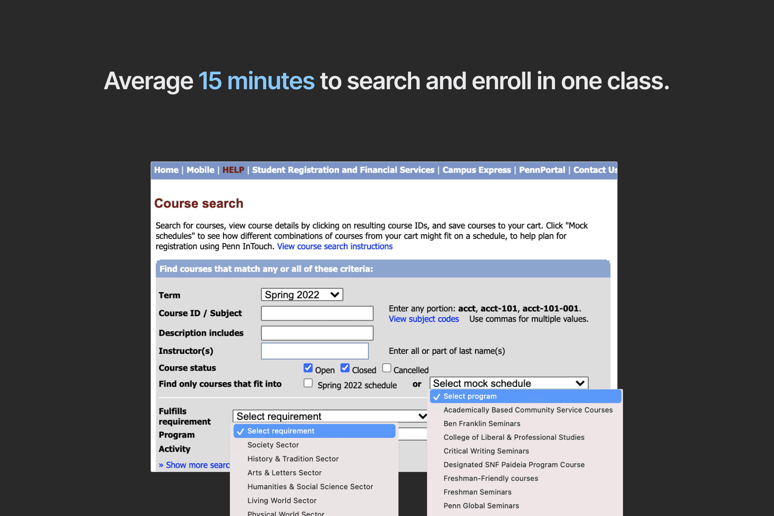
Users spent 15 minutes searching for and enrolling in a single class.
In my observations, users often got stuck on minor tasks that added steps and time. This included toggling back and forth to open their cart, hunting for the right buttons to click, and searching for hidden menus. These small hurdles interrupted workflow and increased the overall enrollment time.
80% of the users had to reference external tools while using PIT
During testing, I observed 12 participants manually blocking time slots in their Google Calendars to see if classes fit into their schedules.

Bad UI leads to negative experiences
The color and UI are very outdated. The poor contrast makes users hard to read. The cart is pretty much unusable, which leads user to reference external tools and adds time to enroll in classes.

How might we redesign Penn InTouch to reduce user time searching and enrolling in classes?
DESIGN
Driven by user insights, I approached design step by step in three perspectives: the user flow, the layout, the features.
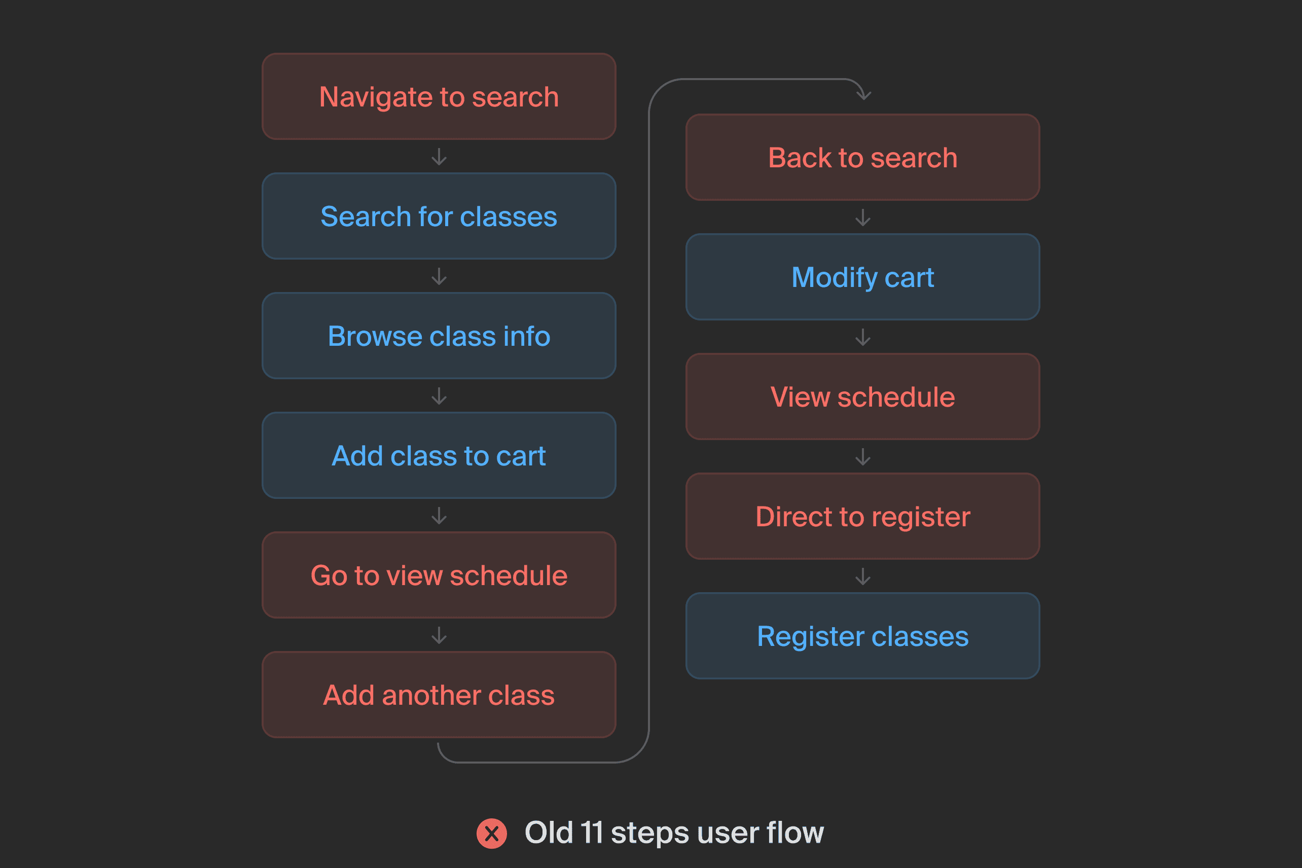
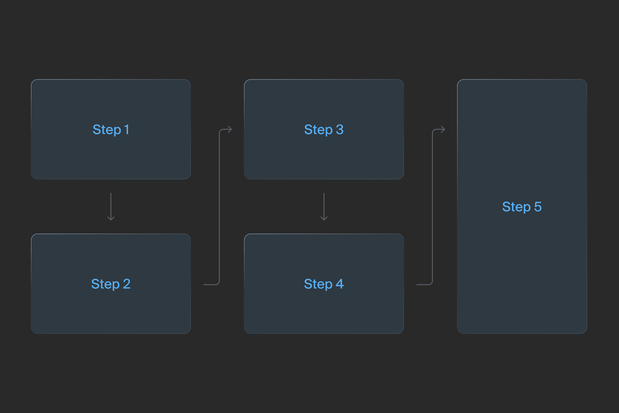
Step 01 - How might we remove redundant steps in user journey?
My goal was to streamline the user journey by eliminating redundant steps. After analyzing the full process from class search to enrollment, I successfully reduced the number of steps from 11 down to just 5.

From user flow to layout
Next, I created three layouts to accommodate the streamlined process :
Option 1: Progress Bar Indicator
Although the progress bar provided guidance, users still toggled between steps while searching for classes. This back-and-forth navigation resulted in longer enrollment times.

Option 2: Continuous Scrolling
While scrolling provided an easy interaction, the singular layout risked becoming an excessively long list. This endless page design could fail pressure tests and overwhelm users.

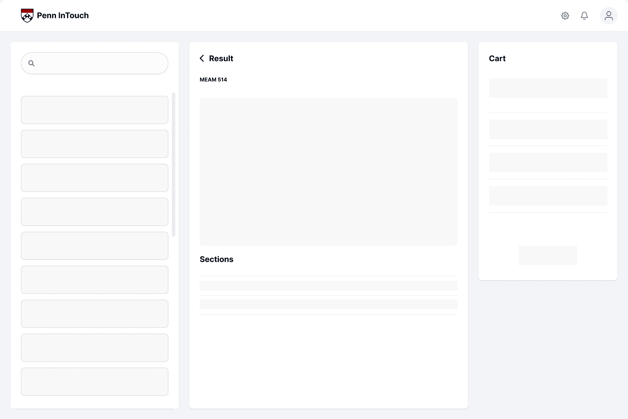
Option 3: All in one Integration
Users could navigate each section with ease, finding the segmented flow intuitive and user-friendly.
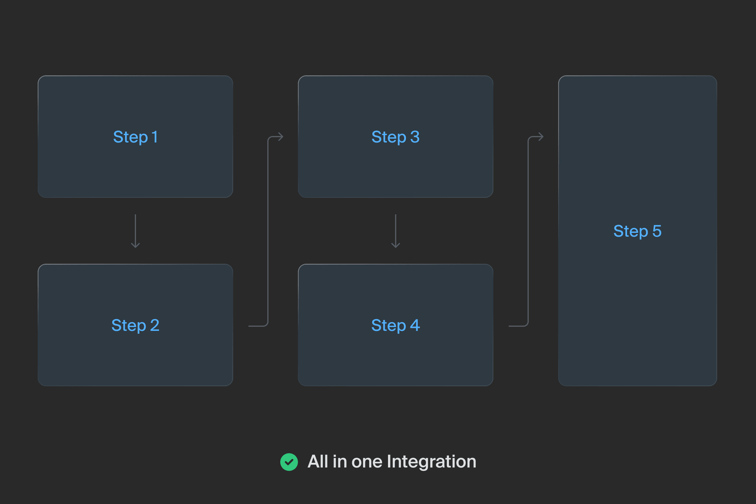
Start from All in one Integration
After conducting A/B testing with five users to evaluate each option, Option 3 proved most efficient for completing registration. With these results, I began creating interfaces.
Step 02 - From layout to Interface
To enhance user experience, I sought to transform the text-heavy system into a more visually engaging platform. My approach was to establish design standards for a web experience, including an accessible color palette and typography following WCAG standards. This allowed me to create a more vibrant, engaging interface.


Step 03 - Integrating features that user need
Drawing from research insights, I focused my design on integrating features that users previously had to rely on external tools for.
Feature 01
Viewing schedules via cart calendar
I noticed that most users referenced external calendar tools while registering for classes. To simplify the process for users, I integrated the class schedule directly into the shopping cart. This allowed for a more seamless experience by eliminating the need to switch between multiple tools.
Feature 02
Enroll in classes with one click
Reflecting on my own registration experience, I recalled having to open a separate tab to enroll in classes, wasting time toggling between screens. To address this issue, I enabled users to register for classes directly in their shopping cart, streamlining the process and reducing time spent switching between tabs.
EVALUATION
Users appreciated the decluttered experience, and here’s some adjustment
After finishing the initial design phase, I conducted user testing with the same 15 participants from the previous A/B testing. The results were encouraging – all testers preferred the decluttered experience and redesigned interface. They appreciated completing the entire process on one page. However, their feedback on specific features prompted further revisions:
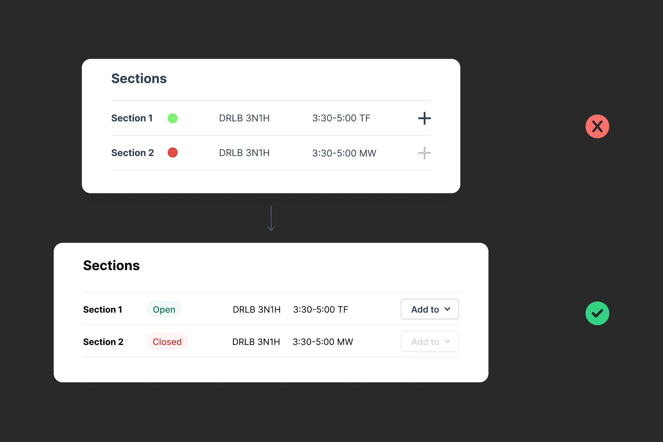
Iteration 1 - Clearer section informations
Users suggested replacing the "+" symbol with a more intuitive "Add to Cart" button when selecting classes. This change would provide clearer visual information about a class's registration status.
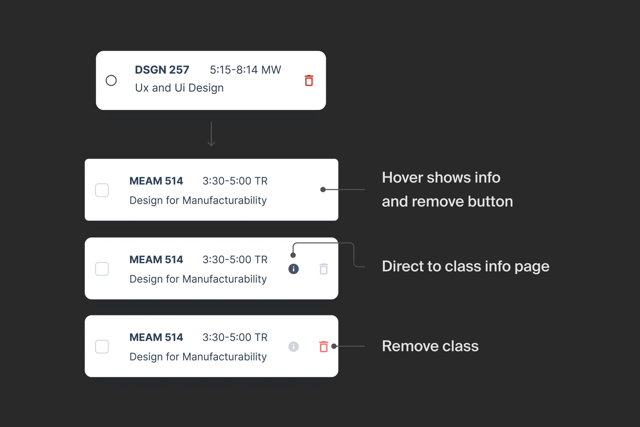
Iteration 2 - Hover to unveil call-to-actions
Based on user feedback, I made secondary actions more discoverable by revealing them when users hover over an item in their cart. I also added an "Info" button to quickly navigate to the class detail page from the cart, making it more convenient for users to access important information about their selected classes.
MEASURING SUCCESS
84% user satisfaction rate and reduced average registration time from 15 to 5 minutes.
After refining the design based on user feedback, I conducted usability testing interviews with 20 students ranging from sophomores to new graduates. I briefly introduced my redesign and asked each user to complete the full experience of searching for and enrolling in classes. I recorded the time spent by each participant. To my delight, all users finished in under 5 minutes, compared to 15 minutes with the current version.
I also recorded screen interactions and captured key frames, then surveyed users' satisfaction. Out of 186 responses, 84% expressed satisfaction with the redesigned interface and flow. 75% wanted to switch from the current Penn InTouch to the redesign as soon as possible.
Other projects
